Project
PLAYYIN
Brand brief : Launching a multifaceted gaming app with an integrated data insurance feature necessitates a vibrant and cohesive brand identity. Embracing a colorful branding approach captures the app’s dynamic essence, blending entertainment with security. The visual identity should juxtapose lively graphics, captivating color schemes, and intuitive design elements, reflecting both gaming excitement and data protection assurance. Balancing playful aesthetics with trust-inducing imagery, such as shields or locks, ensures users perceive reliability amid enjoyment.
LOGO
A logo is a graphic mark or emblem that represents a company, brand, or organization. It serves as a visual symbol to convey identity, values, and offerings. Essential for branding, a logo incorporates elements like typography, colors, and imagery to create immediate recognition and foster brand loyalty among target audiences.


COLOR PALETTE
In branding it is pivotal to influence perceptions and emotions through colors. Consistent colors build brand recognition and identity. Each hue evokes specific feelings; for instance, blue may convey trust, while red signifies passion. A cohesive palette ensures brand cohesion, aids recall, and fosters a distinct brand personality in consumers’ minds.

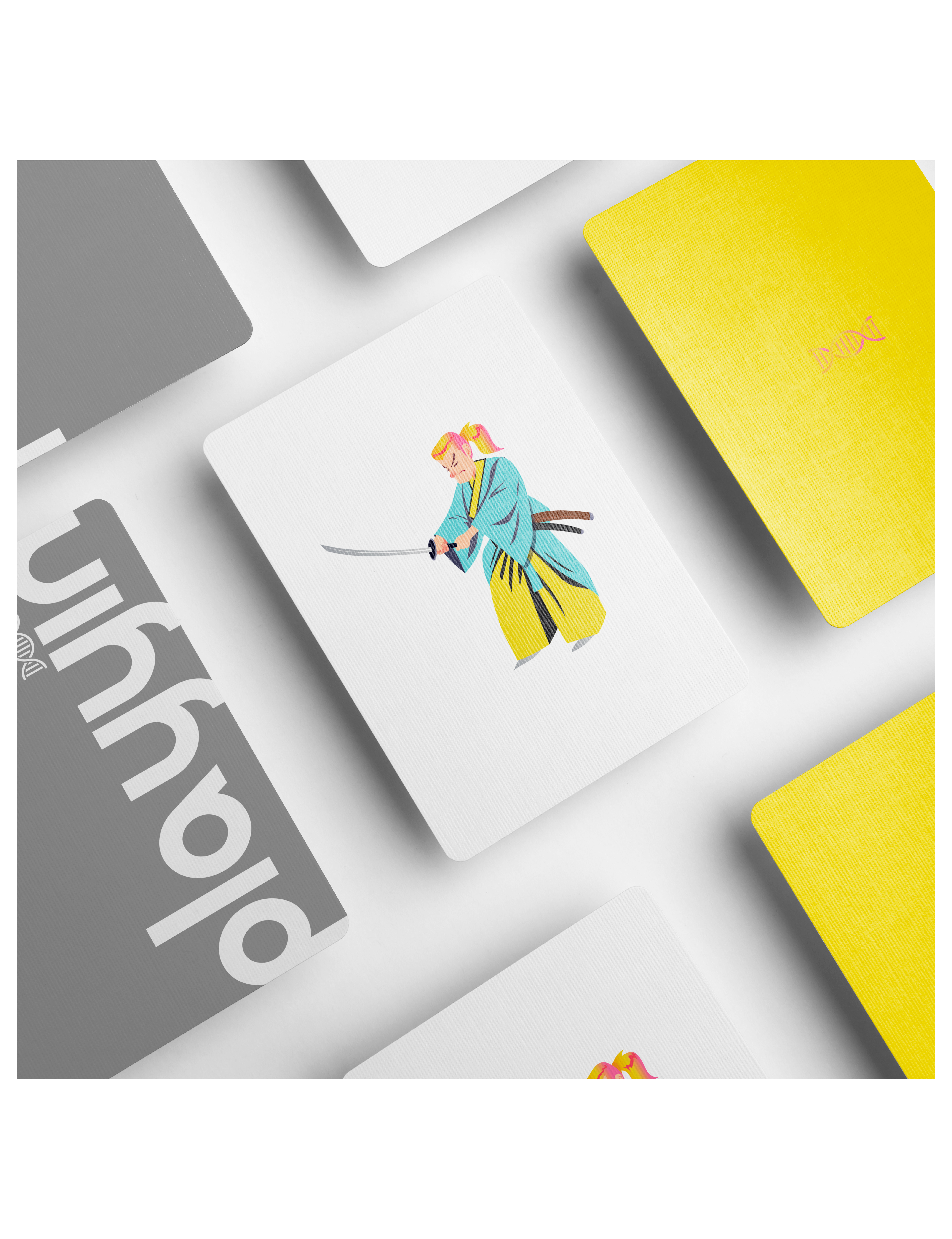
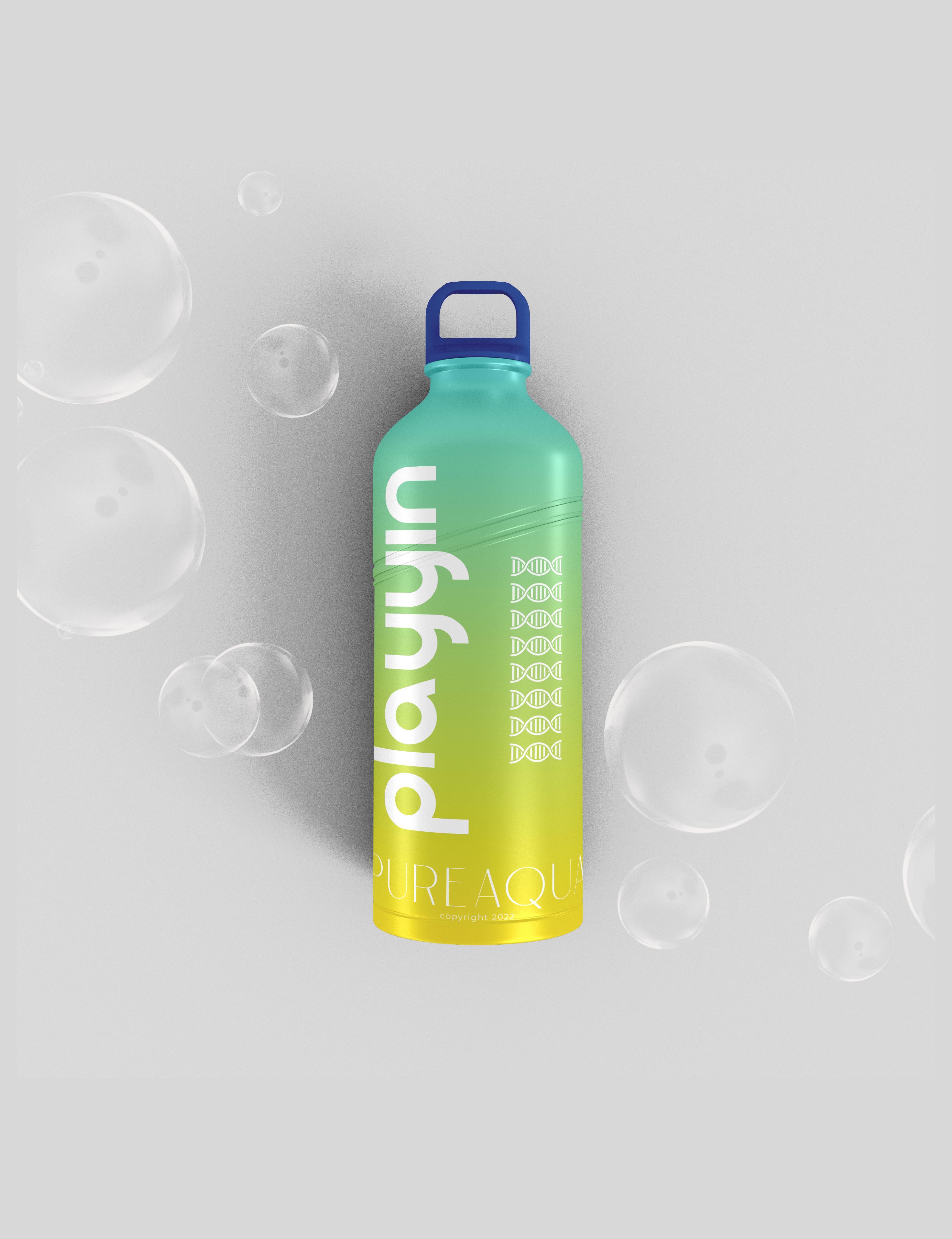
COLLATERALS
Collaterals in brand identity refer to the tangible assets and materials used consistently to represent a brand. These include business cards, letterheads, brochures, packaging, and promotional items. Designed with cohesive visuals and messaging, collaterals reinforce brand recognition, values, and consistency across various touchpoints and communications.


